How often have you laughed at at somebody pulling on a door with a big sign saying "PUSH"? Or done so yourself? But it isn't always your fault. Sometimes it's the door's fault. For very basic anatomical reasons, a horizontal bar on a door says "push" to us, while a vertical bar says "pull." If you put a vertical handle on the right side of a door, and label it "push," most people will pull it. That's because the handle spoke to us directly, and we did not bother to read the label.
This is a failure in what interaction designers call "affordance."
(It's also an illustration of two other principles of interaction design. First, no one reads labels or instructions unless they have to. Second, if your interface does not work when people don't read the instructions, your interface has failed.)
Affordances are the things that objects can do. The great interaction designer Donald Norman adapted the concept from the psychologist J.J. Gibson. It's been so badly misused that Norman says he "imagine[s] J.J. Gibson sitting up in his grave staring at me once again, and then, which a rich, dramatic gesture, shutting off his hearing aid and lying back down with a look of disgust on his face."
But in his books The Design of Everyday Things and The Invisible Computer, Norman discusses the idea of "perceived affordances," the subtle messages sent by physical objects about what you can do with them, and how you can do them. Like the message that door with the vertical handle was giving you: "Pull me."
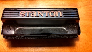
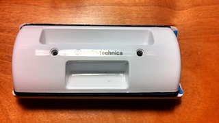
This morning I was putting some records on, and noticed a classic example of this problem. Pictured below are two record-cleaners. They are similar to clothes brushes, in that they only work in one direction. If you run them over the record in the wrong direction, you'll deposit dust on the record rather than cleaning off.


When I reach for the white cleaner, I never get the direction wrong. But when I reach for the black one, I always have to double-check the direction, even though it has two large arrows pointing in the correct direction.. Why is the white one, with no label, easier to use?
Because it sends a very clear message with the structure of the finger grips: One side is long, for your fingers, while the other side is short, for your thumb. Its design not only tells you how to pick it up, but makes it difficult or impossible to pick it up incorrectly. Meanwhile, the embossed black arrows on the other cleaner are not that easy to see, and require a moment of thought, versus the white one which you pick up correctly without thinking. (Also notice where the designers spent money on the black cleaner: highlighting the name of the maker in red, rather than the instructions. Classic.)
Software developers and designers should think a lot about things like this, and door handles. It takes a peculiar kind of arrogance or blindness to design something that is quietly unhelpful (like the black record cleaner), or completely misleading (like the vertical door handle) and to blame the user for getting it wrong.
If your users are consistently getting something wrong, it's your fault. And adding instructions is not the answer. Simple tasks should not require thought, especially if they are essentially impediments to what the user really wants to do. The person pulling on that vertical handle did not set out to open the door. They wanted to get into (or out of) the building; the door was simply a necessary step on the way to what they wanted. Likewise, I did not walk over to my turntable to clean records. The cleaning was a minor task on my way to my real objective, which was to listen to music.
So stop laughing, get a screwdriver, and fix your damn door handle. You can't afford those kind of failures.
(The title of this post comes from Chapter 8 of Norman's The Invisible Computer, which I cannot recommend highly enough.)
- Ken's blog
- Login to post comments
